Metrics
This page gives you a real-time and historical view of a specific waiting room. It is accessible by clicking on any waiting room (active or completed) from the main waiting rooms list.
Overview
The Monitoring Dashboard shows how your waiting room is performing during and after an event. You can instantly see:
- Key configuration settings
- Live visitor traffic
- Historical timeline of the waiting room
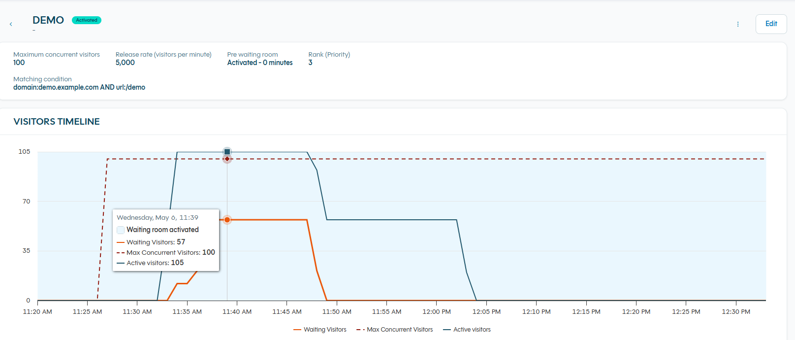
Visitors Timeline Graph
The main chart displays the full history of the waiting room in one view.
Three lines are shown:
- Active visitors (blue line) — number of real visitors currently on your site.
- Waiting visitors (orange line) — number of people currently waiting.
- Max Concurrent Visitors (dashed red line) — the configured threshold.
The graph automatically updates in real time. You can zoom, hover for exact values, or scroll to see the full history.